Original Photo Retouched Photo
For this angle up photo, I made the tree and sun brighter and
more vibrant while I dulled myself to add
movement more toward the subject.

For this side-lighting photo, I overall lightened the photo and darken the shadow and kind of made my earring the focal point. (weird, but that what caught my eye first, so I thought i'd 'exaggerate' it more.
So, this is a rule of thirds photo of the marvelous Mr. Brandt (+5 points! Yeah!) I made him the subject, and blurred/smudged the background and brightened his shirt/body and made him bigger.
Okay literally, this is photo is the best I've attempted to edit, and since I still kind of don't know what i'm doing, I think this looks great! I used the clone tool and erased my legs and shadow of keys. This one's the best ever.
 I love this picture, made it like I did the brick wall.
For this picture - I love it - I added contrast to it, made the colors more vibrant
This picture, i wanted to make look older and more vintage, i was going to make it a 'theme' of my photos, but i just just went with what looked nice.


 With this pictured, i struggled alot,i thought the bottom reflection look weird so, i eventually tried to use the clone tool - that didnt work and sooner or later this just happened. i have no clue how. But. It's better that it was looking!
With this picture, i put the focus on the blue and made it brighter.
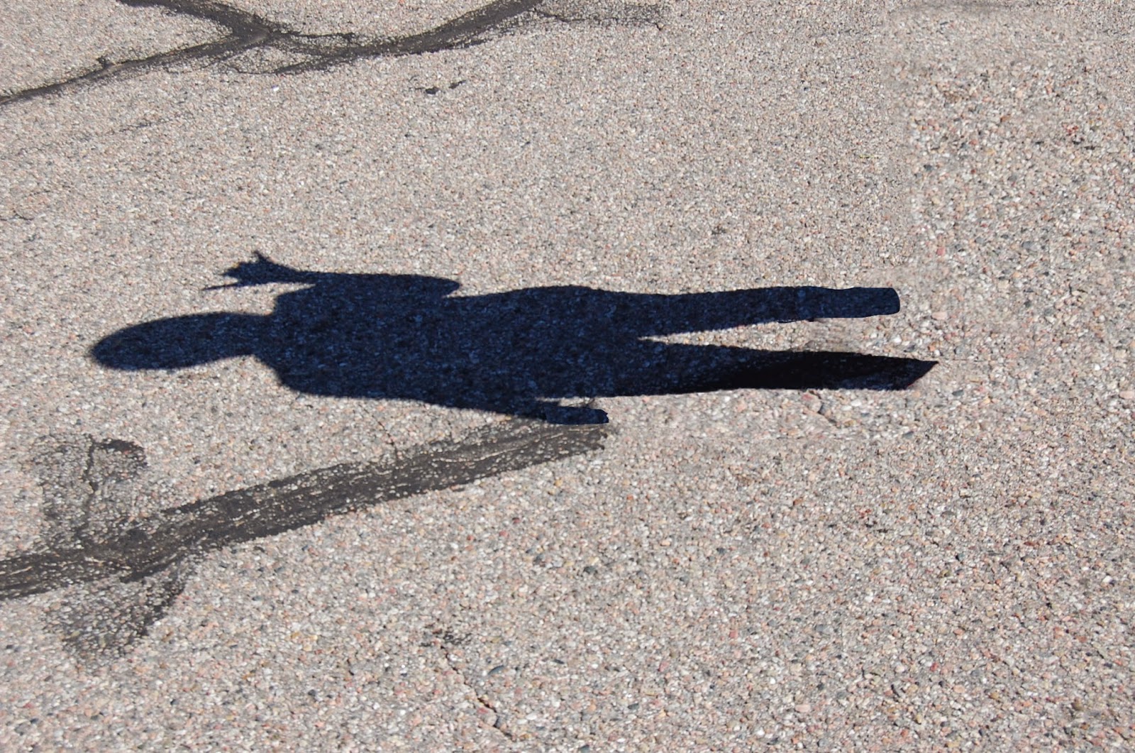
With this picture, I made the sillouette darker and blurred the background more.


 For this picture, I tried to make


No comments:
Post a Comment